Dialogue
Client: Dialogue: Virtual Student Counseling
Role: Creative Direction / Brand Design / Graphic Design / UI Design/ Hand Lettering
Dialogue is a high-impact telehealth program focusing on mental and behavioral health assistance available to school districts across the country. Dialogue provides middle and high school students with virtual access to mental health professionals anywhere in the U.S.
The Challenge
The challenge with refreshing DialCare’s mental wellness program for students was how to create a branding system that would increase engagement with a young target audience of 11-18 years old. Creating a sub brand of DialCare Mental Wellness that specifically targets students, allowed for more specific marketing strategies. The brand has a clearer vision and there is more direction with future advertising plans.
Key Takeaways
-
Understanding target audience
Creating a visual brand that specifically targets a certain demographic was more effective than trying to target a wide range age group of 11-65 years old.
-
Using templates can be great when designed right
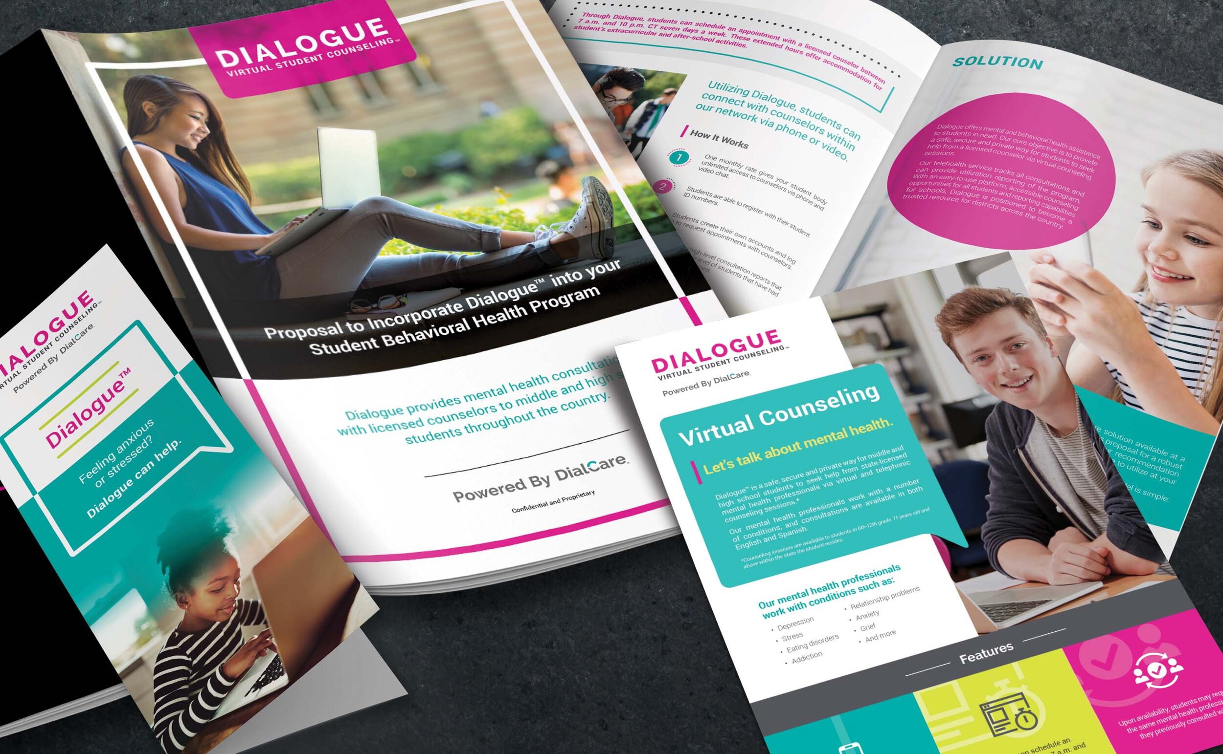
To simplify the materials for each school, I designed templated marketing collateral. I designed a poster, brochure and flyer that could be used be used by all school districts. The districts have the option of adding their logo if desired.
-
Power of Design
Through strong visuals and causal tone of voice, the brand can appeal to a younger demographic and help remove the stigma associated with mental health.
Branding
Color selection was critical for the rebrand. It was important to use colors and design aesthetics that would resonate with the young users. Studies have shown that Gen Z is attracted to bright and contrasting colors. Pantone Rhodamine C and Pantone 389C were the selected colors for the brand. They were chosen because they are bold and positive. The pairing of these two colors creates a unique and fresh vibe for the brand. They give the brand that one-of-a-kind feeling and separate Dialogue from its competitors.
Logo
The logo is a simple and modernized logo that represents Dialogue as a contemporary company. The logo was created with using 2 different typefaces: Raleway and Roboto.
Digital Design
I provided creative direction and designs for the website.
Interactive Features
Click anywhere to interact with these prototypes.
Designed Every Print and Trade Show Touchpoint
I have designed every print and trade show touchpoint for the brand from all aspects of the visual experience.


